Branding the Aloha state of mind.
Kaua’i Hemp company had an incredible product but less than incredible branding. So we sat down with them to figure out what their sense aloha was and how they wanted to convey that in copy and visually.
They first wanted to separate themselves in a new but crowded space. That started with a quick workshop to figure out what their core principles are. We soon landing on five key principles. Authentic, erudite, premium, positive and bold with also a nod to Hawiiana.
This lead us to create a simple but hard working identity that can be useful across multiple channels. We landed on a palette that felt authentic to their spirit and developed the design language that would carry across packaging, website social and even retail.

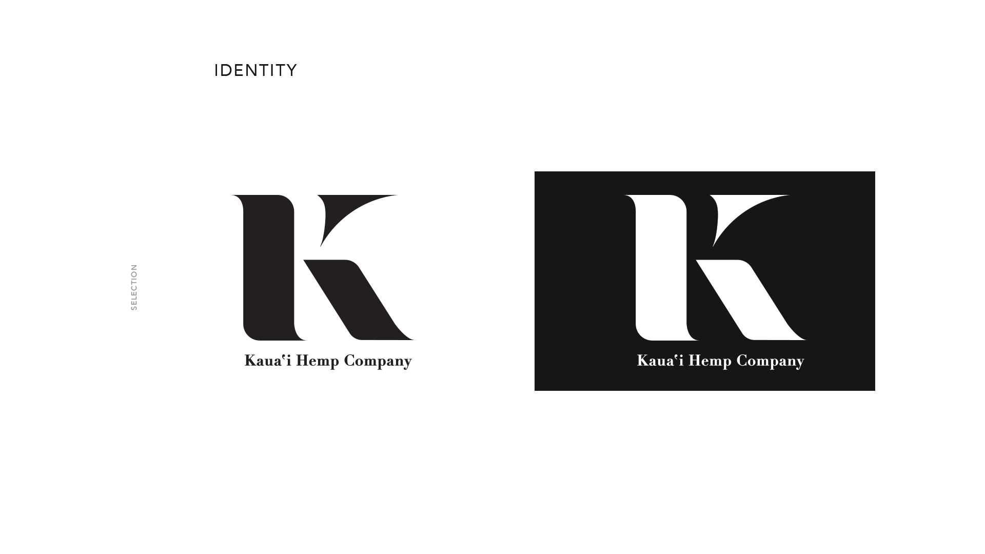
The client wanted a mark that was hard working. Kaua’i Hemp Company is a mouthfull. The first goal was to find the efficiency inside of the words, then translate that into the form factors needed to best reflect the company pillars.
By separating the ascender of the K, we can hide the lower case h inside of the capital K. The weight of the letter forms also creat opportunities to use shapes as masks in packaging or for SKU versioning as well.

Kauai Hemp company Landing page
Kaua’i Hemp Company homepage design


